Showing posts with label skull. Show all posts

2.13.2013

reality


suede 23

mandalas have a sort of rule: 
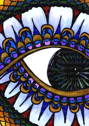
you start in the middle and go around, adding, and making it grow - that satifies and centers me. it gives me the freedom to make the same details over and over and around, leaving me to just come up with colors and a way to finish it off. it's like following the lines of a street. i stick to the edge, working one layer at a time. it gives me a way to channel my obsessive need to control. i like to make off-center mandalas like this, to allow a peak at the surrounding atmospheres....


suede 22 and 20

paisleys give me very small areas to fill. boundaries are all important in my drawings: outlines and limits. i believe this need is a fight against my brain trying to control me. i turn on it and try to show i'm stronger. :)


suede 18

i have loved sugar skulls since the first time i saw them, and think that drawing them has even made me fear death a little less. (well, that and my newfound freedom from religion, which partially came about as a rebirth of my love and adoration for science). funny thing, though, i thought i would be more grounded in reality...turns out my mind doesn't play well with reality....
 

10.03.2012

more journal pages


journal page 15
another micro-worldy vision...


 page 16
heavy on the blues for most of this post. i didn't like blue most of my life, but i find myself reaching for it all the time now, along with lavenders and aquas....

 
 page 13


 pages 14 and 12
i thought the patterns in 14 were like the curves of glaciers, so i went with an icy slice. ice and snow crystals are so perfect and beautiful....
and 12 was a challenge to not fill in the page. i think i may have even left the leaves white to tease myself....i can be so mean lol.


6.13.2011

art journal, pages 16-21


 pages 20 and 17
this layering thing i do has always been a means for me to create order from chaos. it immediately gives me a sense of control, lining up all of the little details...
i am very inspired by embroidered ribbons.
 --------------------------------------------------------------------------------------------


page 16 
i wasn't sure how to finish this page, i wanted the skull to stand out. my need-to-keep made me scan before i added the detailing, so i could have both versions. :P
----------------------------------------------------------------------------------------


page 18 
not inspired (or maybe just mentally tired) i resorted to my blobs. since that didn't give me any desire to detail, i outlined. this allowed me to fill space without having to decide how...
------------------------------------------------------------------------------------------ 


page 21
on this day i felt like being more subconscious than pretty, and pulled a quote i like to give it "sense". it's how i felt that day. i really love outsider art..."raw" art...especially artists who have no training and draw with a very sophisticated childrens' style. 
when i used to have "psychotic" episodes, i would draw in symbols. i have seen several artists who are schizophrenic who use this method to communicate things that don't "make sense" to others. i could go freudian and explore the symbols i currently use a lot, but eh, that sounds too heavy. 
no matter your skill level, draw. even stick people or a little house with a tree take on special qualities that make them yours alone. the lack of art training makes pictures "speak" more, because you are concentrating too hard on just making the lines, and hopefully you forget to worry about perfection.


7.26.2010

ACEO summer style...


these, like my postcards, were TV-watching time passers. there is a little bit more descrip on my flickr.


6.29.2010

peace board


 if you came to my blog from my flickr, sorry for the repetition...this book board was saved from my book disassemblings...which i stopped because i finally urged my OCD self to just look for collage materials as i go along, instead of trying to catalog everything. the book board idea is from several collage artists i found online who use them as bases for collages. great idea, because they are dry and absorb glue really well. for marker drawing - not so great, i realized 2 seconds into my drawing. so i had to use colored pencils. i have been loving the intesity of my sharpies and bics when i draw on smooth bristol, so i wasn't happy that i had to have a softer look.  after my daughter suggested the pencils might actually work better on a peace drawing because of the muted-ness of the color, i carried on.  it took a lot longer than my marker work, but i do like how it came out.


 i scanned this in B&W before i took-on the coloring, in case it didn't turn out well.
then i thought about making pages to sell as color-yourself prints. dover publishing sells a lot of detail coloring books...i love them.


 as you can see from my photos here, i had to pr - ok - well, i didn't HAVE to, but i chose to press very hard to achieve solid color. i have a thing for crinkly paper and permanence, so i always press very hard when i write.  does anyone else miss the smell of papermate ink on a freshly written assignment? i was one of those kids who wouldn't use a crayon lightly, all of my colored pages were heavily filled. i try sometimes to abandon that urge, in fact i started another journal and the first page is softly drawn.  i will post it later.

all in all, i have a goal to try and grow larger drawings. i have been asked to trade and sell something like an 8x10 size, so i am working toward that.  this fulfills that goal, i might try to print it to see how the colors come through.


5.20.2010


i am really happy with the three above, somehow they worked better than i thought. i got some new blick markers from my best friend in ohio!!  (thanks, missy).  she picked some lighter colors, so i'm excited to use those to do something new or at least a little different. we'll see how that might work with some vintage or magazine images thrown in...
here are three ACEOs i used a bit of collage in:
the eye from a catalog, the two heads from a vintage encyclopedia.


...and some magic. think i'll stick to the collage thing...


i have failed to open my ETSY store on my birthday, may 4th.
i had a description put in, and i went to add my photos, but they were TOOBIG!
so, back to photoshop to chop.
starting to wonder if it's not worth it for the few dollars i'll make?

i have, however, started a FACEBOOK PAGE for art and art friends form flickr, blogs, etc. i hope to make that a place to discuss process and product and maybe turn this blog into a place for discussing and sharing depression and other mental health issues as it pertains to art. or the other way around. either direction, i completely believe in and depend on art as therapy, and want to share that with others who do the same or who didn't think about art as a healing process. there are 198765 things going on in our life right now, so working on this is helpful but will be slow going...i am keeping up with my flickr the most, since i am getting into the networking thing


3.05.2010

new direction, kinda


so since i think my drawings are getting boring, i decided to try harder to add some dimension or substance. i feel ok that these are an improvement, and am newly refreshed and addicted to ACEO-sized pieces. i will even try a bit larger size, postcard or even a few of my vintage book boards. i'm laughing because i would like to do a few ACEOs horizontally, but my OCD is preventing it. i assume ahead of time that it won't work, that it will be odd due to the standard-ness of the trading card.

as far as color, i think it's amusing that "my" colors are really all muted, natural tones. you can't find red or orange anywhere in my house.              
ok.  i'm lying. right this instant i am wearing a red t-shirt. it has paint on it, though, so it isn't official enough to count. i prefer the serenity of earth tones and the peace they bring to my mind. tonight i will use my new colored pencils. i made sure, even though it was unsettling, that i picked some bright colors. i like the brightness of my pieces, so having the option to work in more muted or blended tones will be interesting.  
see? i'm already obsessing.


one more mandala and a 2 x 2 incher. i reeeally like how the greys turned out.  i used my bics and sharpies, including the new cafe colors (latte?) i don't do coffee, but i loove these new shades. i have enjoyed some of the monotone detail drawings i have found on flickr, i wonder what it would do to my system to work in one shade for the whole piece...


OH, WAIT!
i forgot to mention that i worked on my my FLICKR page, and now have all the things i have posted here (art-wise) on my FLICKR page so that whoever doesn't want to read stuff can go there to view everything together.  the colors actually look better here, because if you watch the slideshow version of FLICKR, the black is nice, but the size reduces the clarity too much.

but i have to say, that i am COMPLETELY HOOKED on FLICKR and have been trying to soak up as much art and photography as possible, building up my favorites list.  i will be posting both my FLICKR and ETSY favorite sellers badges here on my site, prolly on the LINK page. (i'm not overusing the word FLICKR anymore).


8.12.2009

more published!


i am so thrilled to share that two of my exemplars were chosen for the halloween issue of somerset!! since it's not on the shelf yet (sept 1), i wanted to share what i submitted and what they used.... what an awesomely talented group of artists i was in the company of!!!! thanks to all of you for the ongoing inspiration in each issue....
the two alphabets were included, but none of the others. i was going to add a photo of the CLUES alphabet with some side-lighting to show the shadows and lifted letters, but somerset still has my stuff :) .. i'll add it later.